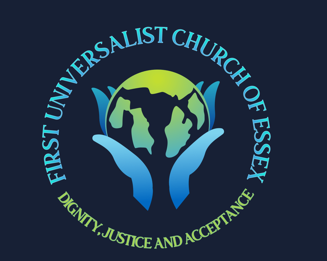
Concept #1
This concept is made up of caring hands that are holding the earth. It incorporates the first three of the Unitarian seven principles of Dignity, Justice, and Acceptance into the design. It was felt that this is the foundation of our church mission.

.png)
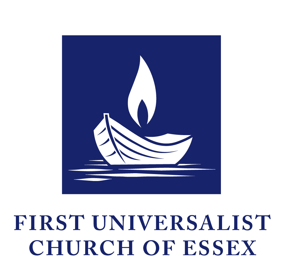
Concept #2
Inspired by other Unitarian Universalist flaming chalice logos, including a classic serif font and flat illustration style, which is optimal for print. The rich navy was chosen to feel nautical along with the boat (representing this region), and the flame illuminates a world that we feel called upon to serve with love and a sense of justice. In contrast, gradient styles, as seen in some other examples, would be vibrant on a screen.
.png)
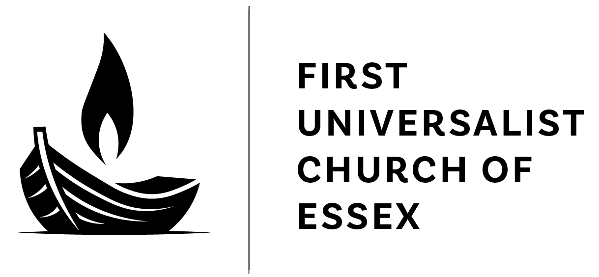
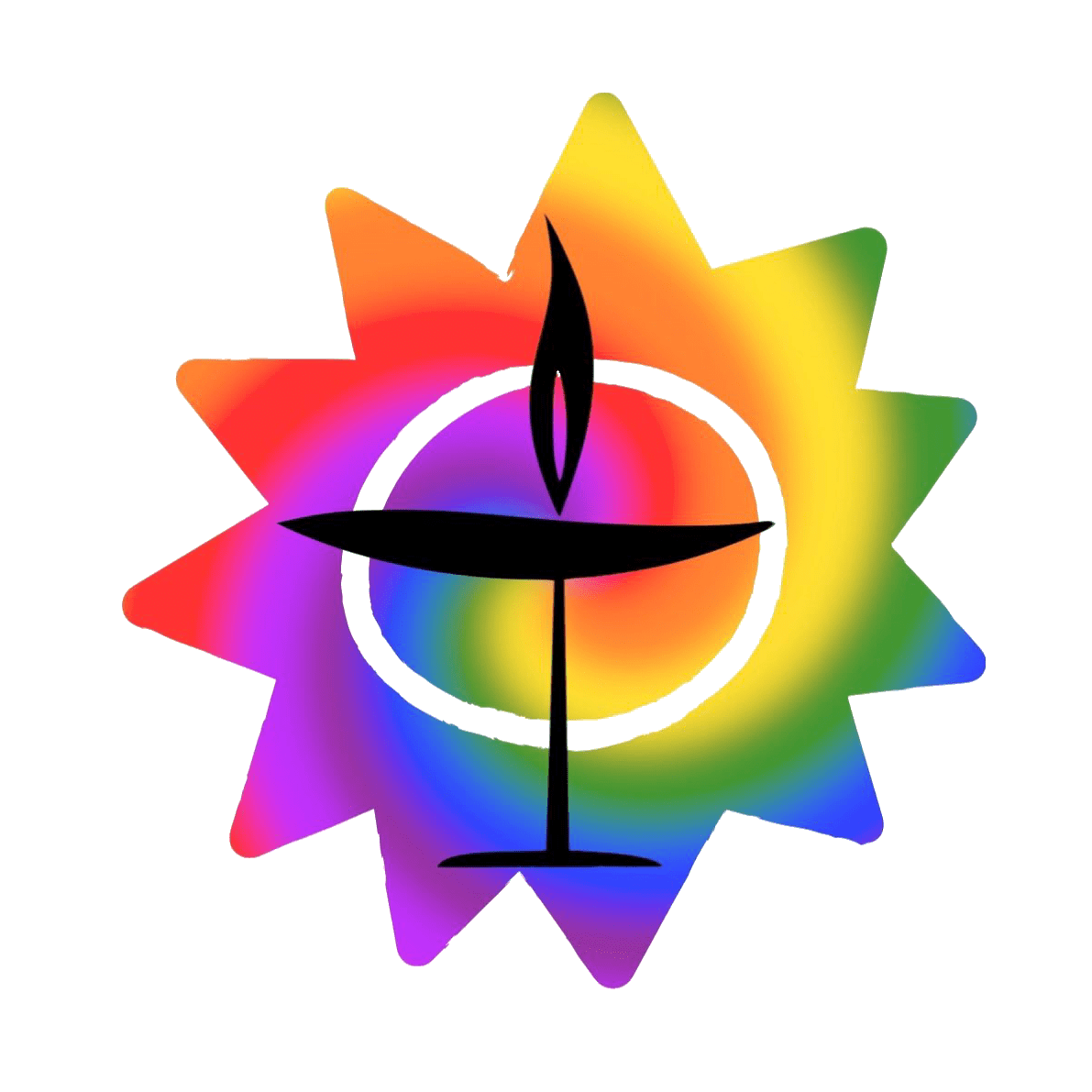
Concept #3
Chalice inside rainbow star

.JPEG)
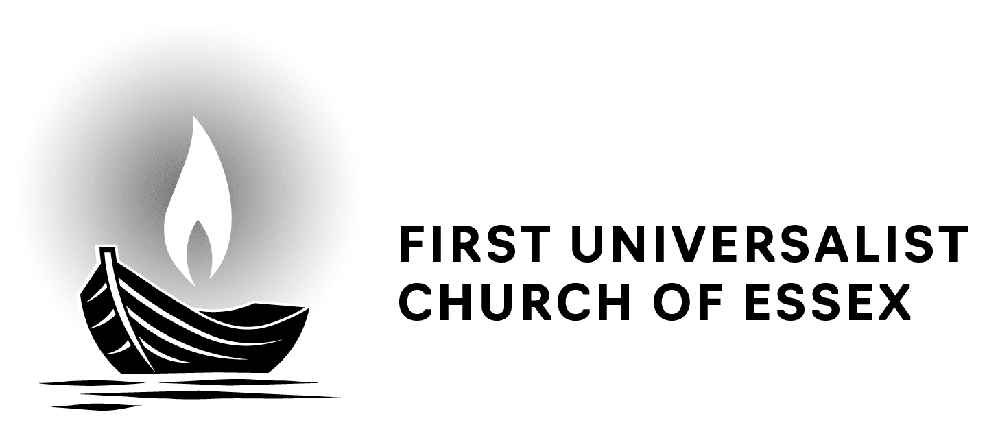
Concept #4
The goal of this concept was to capture a bit of a sense of the building and the welcoming flame and to reference the closeness of the ocean that surrounds us. In the first set, the waves were abstracted a bit (which also turns into UU and looks a bit like a smile); in the second set, the waves are more obvious.

.png)
.gif)
Logo Concept Selection